Picture this: you step into a room that instantly captivates your senses. The colors surrounding you evoke emotions, set the mood, and shape your perception of the space. Colors have a remarkable ability to speak to our souls, stirring up excitement, tranquility, or inspiration. They possess the incredible power to influence how we feel and experience our environment.
In this blog, we will delve into the fascinating realm of color theory, unlocking its secrets and equipping you with invaluable interior design skills. We'll uncover the secrets behind creating harmonious color schemes, utilizing color to highlight architectural features, and crafting the perfect ambiance for any space.
By mastering the psychology of color, you can confidently select the perfect hues, create captivating visual narratives, and elicit desired emotional responses from anyone who enters the spaces you design.
Are you ready to embrace the power of color in interior design? Let's begin!
Read also: Minimalism and Maximalism in Interior Design
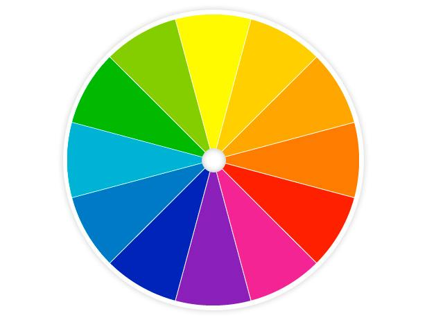
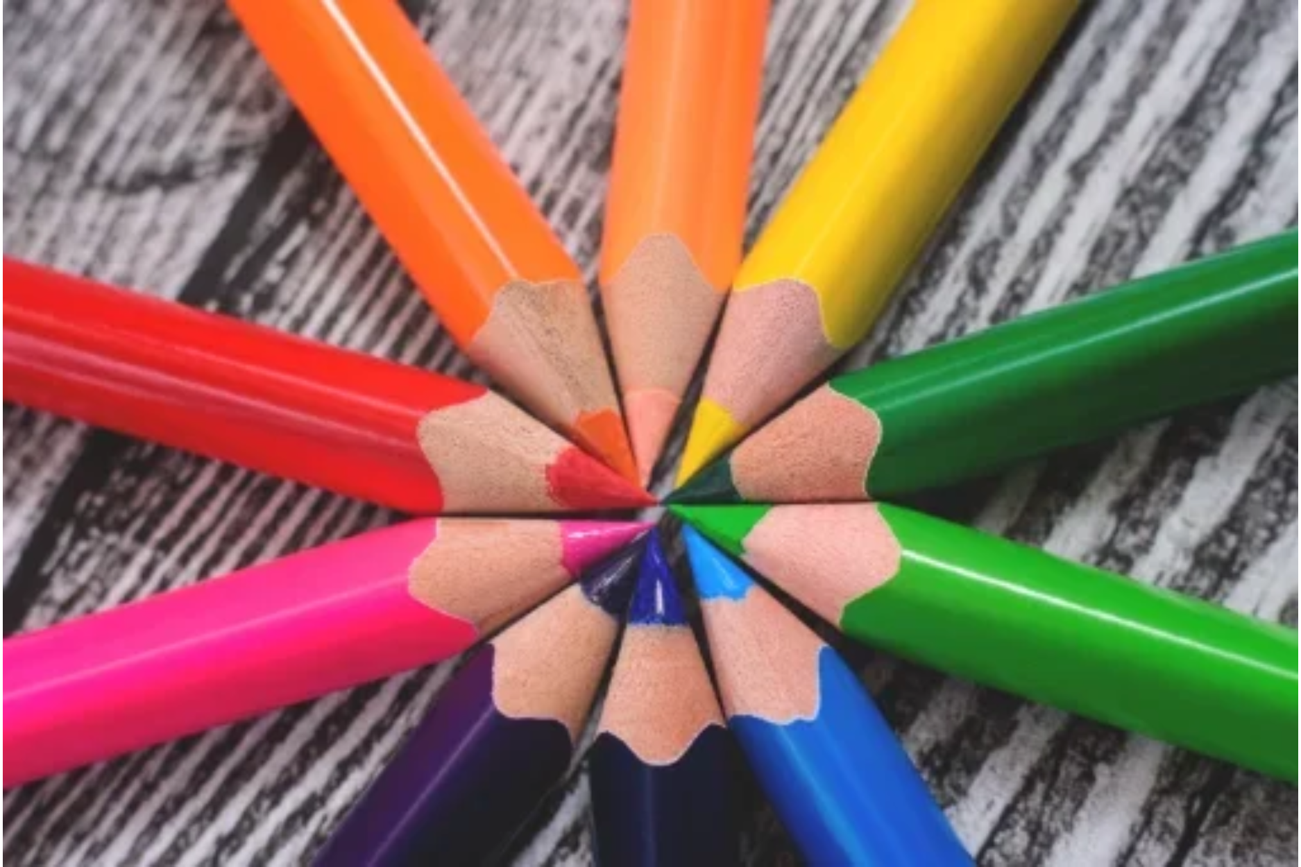
The color wheel is a visual representation of the spectrum of colors, organized in a circular format. It serves as a valuable tool for interior designers to understand color relationships and create harmonious designs.
Color temperature refers to the perceived warmth or coolness of a color. It plays a crucial role in setting the mood and atmosphere of a space.
By strategically incorporating warm or cool colors into your interior design schemes, you can create the desired emotional response and enhance the overall ambiance.
Color harmonies refer to the combinations of colors that are visually pleasing and harmonious when used together.
By grasping the fundamentals of the color wheel, understanding color temperature, and exploring various color harmonies, you are equipped with the essential knowledge to dive into the fascinating world of the psychological effects of colors to incorporate into your interior design.
Let's explore how different hues can profoundly impact our emotions and perceptions in interior design.
It is a renowned fact that colors have a deep effect on our psychological processes.
Let's explore how different hues can influence our emotions, perceptions, and overall well-being in interior design.
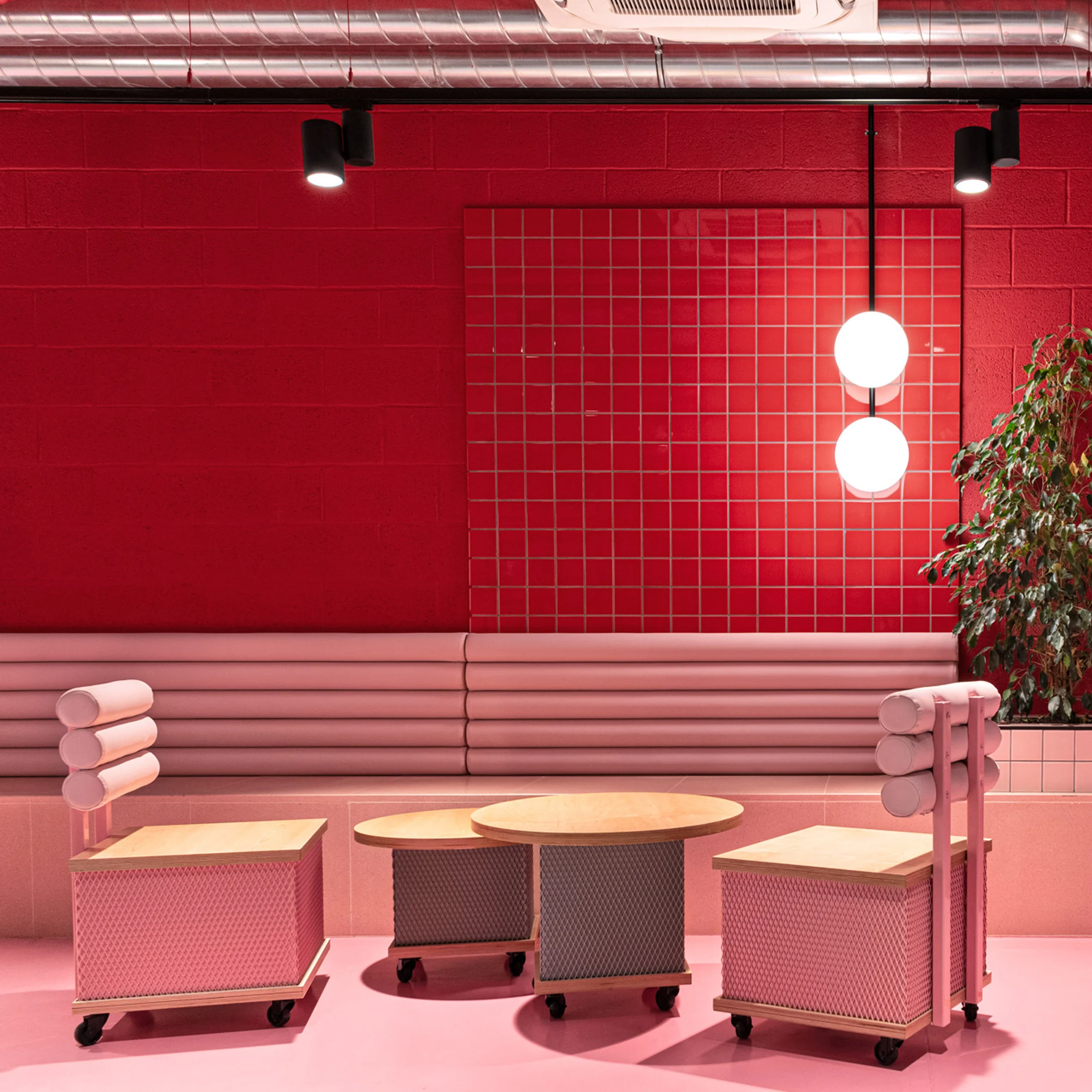
A. Red: A bold and attention-grabbing color, red holds symbolic meaning across cultures and can evoke strong emotions. Use it in social areas like living rooms or dining spaces to encourage lively conversations and create a vibrant atmosphere.
B. Blue: Known for its calming and soothing effects, blue has a profound impact on our emotions. Incorporate it in bedrooms or meditation spaces to establish a soothing ambiance and encourage a sense of serenity.
C. Yellow: Radiating energy and optimism, yellow has the power to uplift and inspire. Introduce it in home offices or creative spaces to inspire innovation and a positive mindset.
D. Green: With its strong connection to nature, green represents balance, harmony, and renewal. Bring it into spaces where you want to create a sense of balance and connection with the outdoors, like living rooms or study areas.
E. Purple: Symbolizing luxury, creativity, and spirituality, purple can add a touch of elegance and intrigue to your interiors. Use it in bedrooms or elegant living areas to create a sense of opulence and refinement.
F. Orange: Vibrant and energetic, orange exudes warmth and enthusiasm. Consider incorporating it in workspaces or areas where productivity is key, such as home offices or study nooks.
G. Pink: Often associated with femininity, pink creates a gentle and nurturing environment. Use them as a base for various color schemes, allowing other elements to stand out or creating a minimalist aesthetic.
H. Neutral Colors: White, black, and gray may seem devoid of color, but they carry their own psychological implications. Neutral colors play a crucial role in interior design, offering a versatile and elegant foundation for any space. These neutral hues create a sense of balance, sophistication, and timeless elegance in your interior design. They allow other elements like furniture, artwork, and accessories to take center stage.
By understanding the psychology of colors, interior designers can strategically select hues that align with the desired atmosphere, purpose, and emotional response for each space. It's a powerful tool to evoke the right mood and create spaces that truly resonate with their occupants.
Now, let's delve into the practical application of color theory in transforming spaces and creating harmonious environments.
"Color is the brush, and the room is the canvas. Applying color theory in interior design allows us to create masterpieces that evoke emotions, tell stories, and transform spaces into living works of art."
When applying color theory in interior design, one of the key considerations is the ability to create specific moods and atmospheres within a space.
Colors have the remarkable power to evoke emotions and set the tone for a room. For instance, warm colors like red and orange can infuse a space with energy and excitement, making them ideal for areas where social interactions take place, such as living rooms or dining areas. On the other hand, cool colors like blue and green can create a sense of calm and tranquility, making them well-suited for bedrooms or relaxation areas.
To create the desired mood, it's essential to carefully select the colors and their intensity. Bold and vibrant hues can add drama and liveliness to a space, while soft and muted tones can promote a more serene and soothing ambiance. By understanding the psychological effects of different colors, you can strategically utilize them to convey specific emotions and create the desired atmosphere in each room.
Color is a powerful tool in interior design for drawing attention to specific architectural features or focal points within a space. By using contrasting colors or bold accents, you can make elements like a fireplace, an accent wall, or a unique architectural detail stand out and become visually striking. Consider using a contrasting color scheme, where the color of the architectural feature or focal point is in direct contrast to the surrounding elements.
For example, if you have a white wall with a fireplace, painting the wall behind the fireplace in a deep, rich color like navy blue or charcoal gray can make it visually prominent and create a captivating focal point in the room. Similarly, using a pop of vibrant color on a specific architectural detail, such as a window frame or a staircase railing, can add visual interest and draw attention to that particular element.
Color has the remarkable ability to influence our perception of space in the interior design process. By strategically choosing colors, you can visually expand or contract the size of a room.
To create the illusion of a larger space, opt for lighter colors such as whites, pastels, or light shades of gray. These colors reflect more light, making the room feel brighter and more open. Additionally, using a monochromatic color scheme with varying shades of the same color can create a sense of continuity and visually expand the space.
Conversely, if you want to create a more intimate and cozier atmosphere or downplay the size of a large room, darker colors like deep blues, rich browns, or warm earth tones can be employed. These colors absorb light and create a sense of depth, making the space feel more enclosed and comfortable.
When applying color theory in interior design, it's important to establish cohesive color schemes that align with the purpose and function of each room. Different rooms evoke different emotions and serve various functions, and the color scheme should reflect and support these purposes.
For example, in bedrooms and other relaxation-oriented spaces, cool and calming colors like soft blues or soothing greens can promote a sense of tranquility and restfulness. In contrast, energizing spaces like home offices or workout areas can benefit from colors that evoke energy and focus, such as vibrant yellows or invigorating oranges.
Additionally, consider the psychological associations that different colors have. For instance, warm tones like red and orange are often associated with passion and creativity, making them suitable for spaces where inspiration and productivity are desired, such as studios or workspaces. Neutral colors like whites, beiges, or grays can provide a versatile backdrop that complements various design styles and allows for easy customization with accent colors.
Color plays a crucial role in defining the overall style and theme of space. Different interior design styles have their own color palettes and preferences that help create a cohesive and visually appealing environment.
For instance, a modern or contemporary design style often incorporates a neutral color scheme with bold pops of vibrant colors as accents. On the other hand, a traditional or vintage-inspired design style may feature more muted and earthy tones, creating a warm and nostalgic ambiance. Coastal or Scandinavian design styles often utilize light and airy colors like whites, blues, and pastels to evoke a sense of serenity and simplicity.
When selecting colors for a specific design style, it's essential to research and understand the typical color palettes associated with that style. This will help you create an authentic and visually cohesive space that aligns with the desired aesthetic.
In conclusion, understanding the psychology of color and mastering color theory skills are essential for effective interior design. Let color be your guide as you embark on the journey of interior design, and watch as your spaces come to life with vibrancy and purpose.
FAQs
To create balance with color in interior design, consider using a dominant color as the primary hue in a room, complemented by secondary and accent colors. Distribute colors evenly throughout the space, paying attention to their intensity and placement to achieve visual equilibrium. Additionally, using neutral colors as a backdrop can help balance bold or vibrant hues.
Common color schemes in interior design include monochromatic (using variations of a single color), complementary (pairing colors opposite each other on the color wheel), analogous (using colors next to each other on the color wheel), and triadic (combining three equally spaced colors on the color wheel).
Color theory is vital in interior design because it helps create harmonious and visually appealing spaces. It guides the selection of colors that complement each other, evoke desired moods, and enhance the overall aesthetic of a room.
Improve color coordination by understanding color theory, creating mood boards, experimenting with paint samples, seeking inspiration, starting with a neutral base, and trusting your instincts.
Color psychology plays a vital role in interior design as colors have the power to evoke specific emotions and set the mood of a space. Warm colors like red and orange can create a cozy and energetic atmosphere, while cool colors like blue and green promote a sense of calmness and relaxation. Understanding color psychology helps in creating spaces that align with the desired ambiance and the purpose of the room.
Choosing the right colors for your interior design involves considering the desired mood and atmosphere you want to create. Cool colors like blues and greens promote tranquility, while warm colors like yellows and oranges evoke energy. Experiment with color schemes such as monochromatic, analogous, complementary, or triadic to find the perfect combination for your space.